E-Commerce
Checkout Redesign
Modernizing Fandango's checkout to cut friction and errors
Outcome
Reduced checkout errors by 20%
Problem
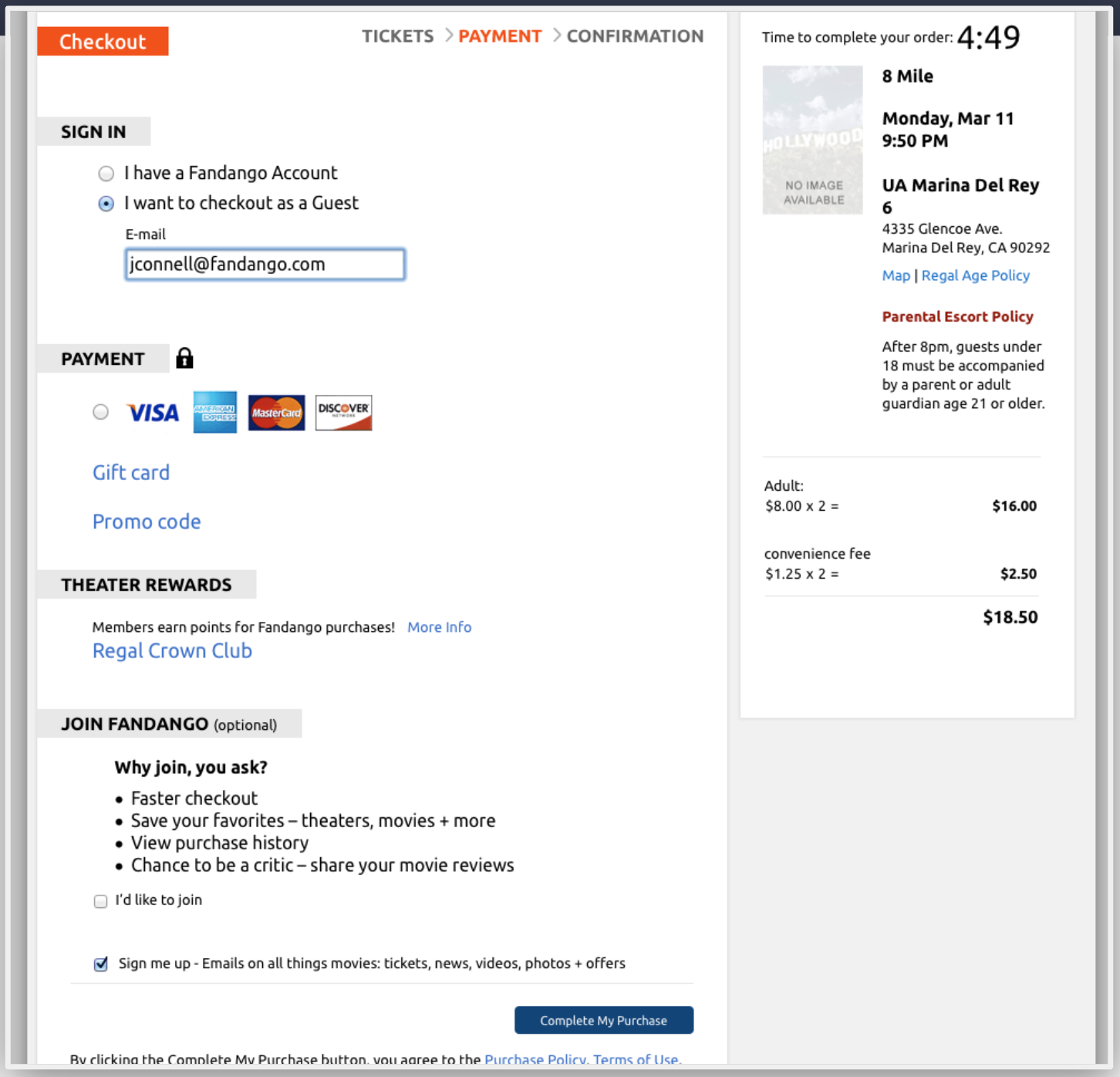
Fandango's existing checkout flow had significant usability issues and a dated look and feel that was directly hurting conversion. The challenge was to completely redesign the e-commerce checkout to be modern, intuitive, and frictionless — reducing user errors and increasing successful purchases.
Process
- 1
Audited the existing checkout flow to identify specific usability issues and bottlenecks
- 2
Collaborated with product and UX teams on workshops to brainstorm solutions, sketches, and concepts for a streamlined experience
- 3
Built wireframes and interactive prototypes for usability testing — authored test plans, moderated sessions, and reported results to the broader team
- 4
Iterated on designs based on testing feedback and stakeholder reviews, keeping the process user-centered at every step
- 5
Worked closely with design and development teams through handoff to ensure faithful implementation
Result
The redesigned one-page checkout reduced errors by 20%, cutting friction and creating a faster, more efficient purchase flow. Post-testing interviews showed users felt more confident and in control throughout the journey — a direct result of simplifying a complex multi-step process into a single, intuitive flow.